TTPro High Low Signals 3 v6TTPro High Low Signals 3 v6 indicator is specifically designed to provide overbought and oversold signals. Bullish and bearish divergences can be used to detect early momentum shifts and anticipate trend reversals. It also gives us When used in conjunction with the other TTPro indicators, we have an added level of confirmation to maximize effectiveness when making entry or exit decisions.
在腳本中搜尋"high low"

TTPro High Low Signals 2 v6TTPro High Low Signals 2 v6 is a leading indicator that can identify trends, anticipating trend reversals and highlight overbought and oversold levels. It is also useful in identifying bullish and bearish divergences and detecting early momentum shifts. Visit www.turbotraderpro.com for more details.
TTPro High Low Signals 1 v6TTpro High Low Signals 1 v6 indicator is a versatile leading indicator designed to identify optimal entry and exit points, overbought and oversold signals, and its also useful in identifying trends. When the signal line is above the mid level, trend favors the bulls and when the line is below the mid level, the trend favours the bears. Bullish and bearish divergences can be used to detect early momentum shifts and anticipate trend reversals also. Visit www.turbotraderpro.com for more details.

Consecutive Highs/LowsTrack consecutive new highs/lows outside the Donchian range. Fans of the oldschool Turtle Strategy should enjoy the visualization.
Same logic as my "Walking the Bands" script, just with Donchian breaks instead of Bollinger tags.

TTPro 2nd High Low Signals V5TTPro 2nd High Low Signals V5 is a leading indicator that can identify trends, anticipating trend reversals and highlight overbought and oversold levels. It is also useful in identifying bullish and bearish divergences and detecting early momentum shifts.

TTPro 1st High Low Signals V5TTpro 1st High Low Signal V5 indicator is specifically designed to provide overbought and oversold signals. Bullish and bearish divergences can be used to detect early momentum shifts and anticipate trend reversals. It also gives us When used in conjunction with the other TTPro indicators, we have an added level of confirmation to maximize effectiveness when making entry or exit decisions. Visit www.turbotraderpro.com for more details.

TTPro 1st High Low Signals V4TTpro 1st High Low Signal V4 indicator is specifically designed to provide overbought and oversold signals. Bullish and bearish divergences can be used to detect early momentum shifts and anticipate trend reversals. It also gives us When used in conjunction with the other TTPro indicators, we have an added level of confirmation to maximize effectiveness when making entry or exit decisions.

TTPro 2nd High Low Signals V4TTPro 2nd High Low Signals V4 is a leading indicator that can identify trends, anticipating trend reversals and highlight overbought and oversold levels. It is also useful in identifying bullish and bearish divergences and detecting early momentum shifts.

Chart Mojo Noiz Day High/LowThis is an intraday indicator that indicates days high, low, mid range (50%), and vwap. I use it on a 5 min chart or under. Its for range trading, also breakouts, and I use the zone between the 50% of range and vwap as a target during the day at certain times..it has "gravity" ..when traders unwind and or position ahead of something, news or certain time zones with tendencies etc price is drawn towards it. Thanks to Noiz for working on the script. Hope it gives you some Chartmojo.

TTPro 2nd High Low Signals v3TTpro 2nd High Low Signal indicator is a versatile momentum oscillator designed to identify overbought and oversold signals, and its also useful in identifying trends, particularly on the 1d chart. When the signal line is above the mid level, trend favors the bulls and when the line is below the mid level, the trend favours the bears. Bullish and bearish divergences can be used to detect early momentum shifts and anticipate trend reversals also.

TTPro 1st High Low Signals v3TTpro 1st High Low Signal indicator is specifically designed to provide overbought and oversold signals. Bullish and bearish divergences can be used to detect early momentum shifts and anticipate trend reversals. It also gives us When used in conjunction with the other TTPro indicators, we have an added level of confirmation to maximize effectiveness when making entry or exit decisions.


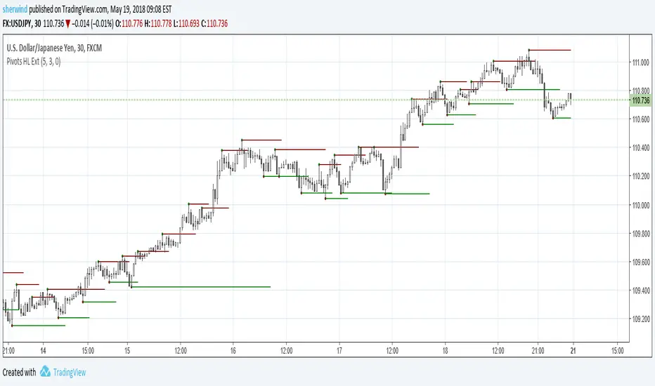
Pivot Points High Low ExtensionPivot Points High Low Extension
See Also:
- A Simple 1-2-3 Method for Trading Forex
- The Classic 1-2-3 Pattern: An Underestimated Powerhouse
- Bulkowski's 1-2-3 Trend Change
ka66: Period-Bounded High/Low LinesIndicator: Period-Bounded High/Low Lines
There's a few similar ones on TradingView already (as expected), nothing particularly special about this, was just fun to write the logic for it, and understand how it might be used to trade.
Interestingly, I just came across the idea from watching Adam Grimes' Chartschool video, "Anticipating Intraday Action":
www.youtube.com
Thought it was pretty neat. Use the "Daily" bound (default) with intra-day interval charts to get the same effect as in the video.
Now, to watch the video for its actual purpose. ;-)


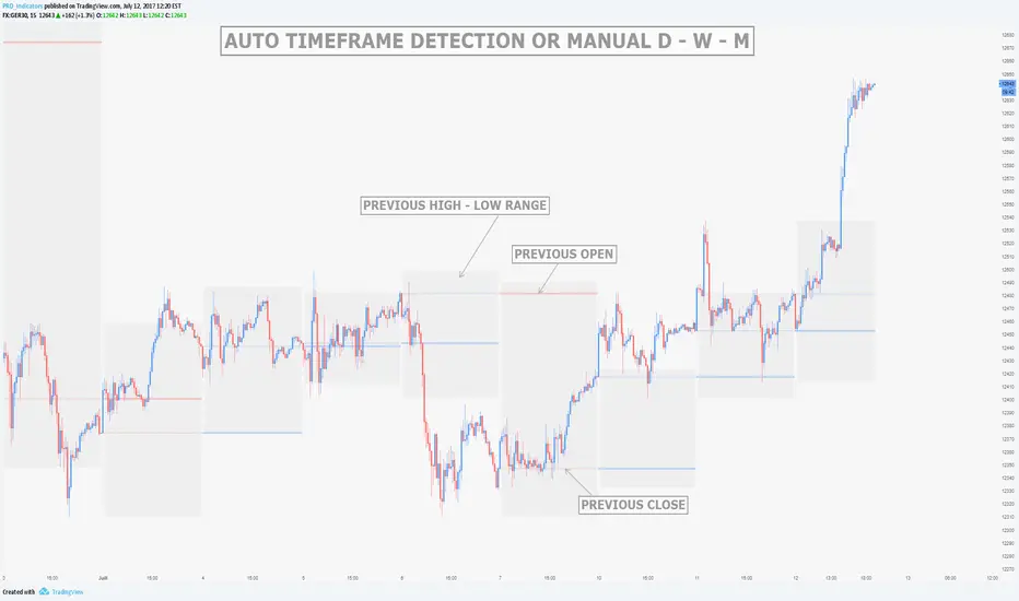
MTF Previous Open/Close/RangeThis indicator will simply plot on your chart the Daily/Weekly/Monthly previous candle levels.
The "Auto" mode will allow automatic adjustment of timeframe displayed according to your chart.
Otherwise you can select manually.
Indicator plots the open/close and colors the high-low range area in the background.
Hope this simple indicator will help you !
You can check my indicators via my TradingView's Profile : @PRO_Indicators

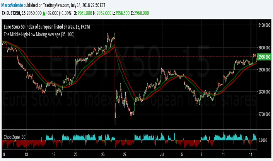
The Middle-High-Low Moving AverageA standard EMA and a Middle-High-Low EMA give a good signal when they cross
Kay_High_LowPrevious High low plotting.
COPIED from Chris Moody's script and adjusted it for my needs.

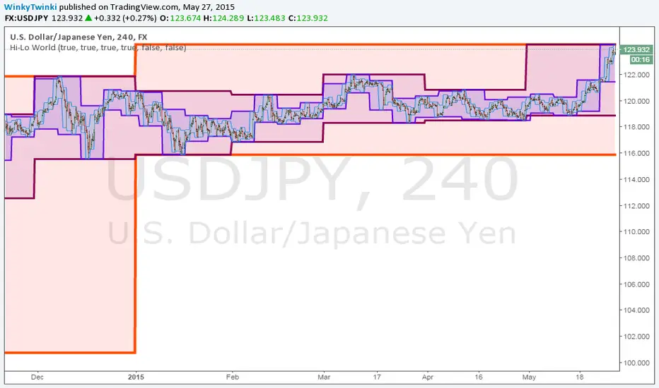
Hi-Lo WorldThis script plots the highs/lows from multiple timeframes onto the same chart to help you spot the prevailing long-term, medium-term and short-term trends .
List of timeframes included:
Year
Month
Week
Day
4 Hour
Hour
You can select which timeframes to plot by editing the inputs on the Format Object dialog.